TL;DR

Get business pricing on tools and workshop supplies
- Business-only prices and quantity discounts
- Tax-exempt purchasing
- Multiple users, one account, clear invoices
House Beautiful’s design report highlights six paint colors that interior designers say can lend rooms a vintage-inspired feel: Wedgwood blue, butter yellow, oxblood, warm parchment, pale peach and midnight blue. The recommendations are designers’ opinions about color and atmosphere, not evidence that paint alone makes a home historically authentic.
House Beautiful has published a report naming six paint colors that interior designers say can give rooms a vintage-inspired character: Wedgwood blue, butter yellow, oxblood, warm parchment, pale peach and midnight blue. The suggestions focus on how color can make newer interiors feel warmer or more established, though the report presents professional opinions rather than a tested formula for recreating a particular historical style. For more guidance, see designers’ advice before choosing a paint color.
The shades span muted neutrals, soft pastels and darker, saturated colors, much like the hues in these designer-favorite paint colors. Wedgwood blue, a dusty blue-gray, is described by Jessica Risko Smith of Santa Barbara firm JRS ID as changing with the light, appearing slate-like in the morning and more like soft denim later in the day. Smith says her team used it in a kitchen renovation to give new cabinetry a sense of age and permanence.
New York City designer Andrew Suvalsky recommends butter yellow, which he connects to the 1960s while describing it as playful and still relevant. For deeper color, Iona Graham, an interior design expert at Graham & Brown, points to oxblood for its heritage-inspired warmth. She says it can work especially well in smaller rooms or on accent walls, where its saturation may create a cocooning effect.
The other suggestions include warm parchment, a softened off-white with yellow or blush undertones; pale peach, which Suvalsky says can feel both fresh and cozy; and midnight blue, a deep shade he describes as regal and architectural. The report’s examples show these colors used in bedrooms, kitchens and a wet bar, alongside details such as wood, brass and a gilded ceiling.
How Color Can Add a Sense of Age
The advice offers homeowners a way to think about character before furnishings: the report’s designers argue that wall color can shape a room’s mood and make new cabinetry or a builder-grade interior feel less stark. That can matter to people seeking a lived-in or period-influenced look without starting with antiques or major renovations.
These are design judgments, not guarantees. A paint color’s appearance can vary with natural and artificial light, nearby materials and the room itself. The report does not compare paint products, provide exact color codes or establish that any of the six shades will suit every home.
Popular right now

Shark Rocket Corded Stick Vacuum (HV301) – Gray/Orange

Vitamix Propel Series 750 Professional-Grade Blender, 4 Programs, Black

Vitamix Propel Series 510 Professional-Grade Blender, 3 Programs, Black
As an affiliate, we earn on qualifying purchases.
Six Shades, Different Historical References
The recommendations combine colors associated with different eras and settings rather than describing a single period palette. Suvalsky links butter yellow to the 1960s and says pale peach appeared in both splashier forms in the 1980s and softer midcentury versions. Smith evokes European farmhouses and coastal cottages when describing Wedgwood blue.
The report also emphasizes undertones and contrast. Warm parchment is positioned between bright, cool whites and more golden shades, while midnight blue is shown against brass and warm wood. Those pairings are part of the designers’ examples; the article does not prescribe a complete decorating scheme or claim the colors are historically exact matches.
“It’s the kind of color you find in old European farmhouses or well-loved coastal cottages.”
— Jessica Risko Smith, interior designer at JRS ID
No Single Formula for Vintage Style
The source does not give a publication date, precise paint names or color codes, or measurements for the projects pictured. It also does not report consumer testing or compare how the shades perform across different rooms. Whether a color reads as vintage will depend on factors including lighting, finishes and furnishings, and the designers’ descriptions should be understood as professional opinions rather than universal outcomes.
Choosing and Testing the Paint
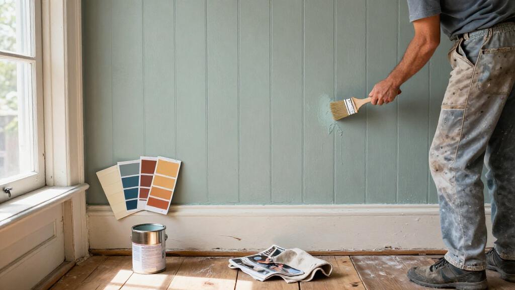
The report does not announce a follow-up study or a next milestone. For readers using its recommendations, the practical next step is to sample the shades in the room and view them at different times of day, since Smith specifically notes that Wedgwood blue shifts with changing light. Comparing samples with existing wood, metal and fabric finishes can help show whether the intended warmth or contrast works in that space.
Key Questions
Which six paint colors does the report recommend?
They are Wedgwood blue, butter yellow, oxblood, warm parchment, pale peach and midnight blue.
Which shade is described as a softened alternative to stark white?
Warm parchment is described as an off-white with yellow or blush undertones that can give a room a softer, more lived-in look.
What color does the report connect with the 1960s?
Designer Andrew Suvalsky connects butter yellow with the 1960s, while also saying the color remains relevant today.
Does the report say these colors guarantee a vintage-looking home?
No. The article shares designers’ recommendations and examples. It does not claim that paint alone guarantees a vintage look; lighting, materials and furnishings can affect the result.
Source: housebeautiful.com