
TL;DR

Get business pricing on tools and workshop supplies
- Business-only prices and quantity discounts
- Tax-exempt purchasing
- Multiple users, one account, clear invoices
House Beautiful published a roundup of 15 paint colors recommended by HGTV personalities, including soft neutrals, deep greens and bold black. The designers describe how they use the shades, but the recommendations are personal design opinions and do not establish that a paint color will raise a home’s value.
House Beautiful has published a roundup of 15 paint colors favored by HGTV personalities, spanning warm whites, greige, blue, green and black. The designers say the shades can give rooms a polished or distinctive look, but the article reports their preferences—not evidence that any color increases a home’s market value.
The recommendations include familiar neutral choices such as Benjamin Moore Revere Pewter, Benjamin Moore Misty Air, Sherwin-Williams White Flour, Farrow & Ball Drop Cloth and Behr White. The designers describe these colors as flexible backdrops for different furnishings and styles. Erin Napier, for example, calls Misty Air a “broken-in cream” that works behind colorful art and upholstery. Taniya Nayak describes White Flour as a soft white that can suit both simple and maximalist rooms.
The list also includes darker, more assertive shades: Sherwin-Williams Tricorn Black, Sherwin-Williams Black Fox, Farrow & Ball Studio Green, and Benjamin Moore Windsor Green. Tarek El Moussa recommends Tricorn Black for accent walls, exterior use or trim, while Cole DeBoer says he likes it on doors and walls. Kristina Crestin says she painted her bedroom—including its doors, windows and trim—in Windsor Green.
Other picks include Behr Mocha Ice and Dragonfly, Magnolia Home by Joanna Gaines Juniper Tree, Sherwin-Williams Dover White and additional shades named in the roundup. Their settings vary: Joanna Gaines describes using Juniper Tree in a satin finish across the interior of a creative workshop at Magnolia’s Silos, while Chelsea DeBoer favors Black Fox for an office. These examples are individual design choices, not a tested ranking of paint performance or home prices.
How Color Shapes a Room’s Impression
The roundup offers homeowners a set of designer-selected starting points for choosing paint, including both understated backgrounds and colors intended to anchor a room. That range matters because a shade that looks quiet on a sample can become a major feature when applied across walls, cabinetry or trim.
Its “looks expensive” framing should be read as an aesthetic judgment rather than a financial finding. The source does not present sales data, appraisals or a comparison of home values. The practical takeaway is to weigh the designers’ descriptions against a home’s lighting, existing finishes and the intended use of each space; a color recommendation alone cannot promise a more valuable property.
Popular right now

Ninja Hot & Iced XL Coffee Maker with Rapid Cold Brew, Black, CM371

Vitamix Propel Series 750 Professional-Grade Blender, 4 Programs, Black

KitchenAid Classic Series 4.5 Quart Tilt-Head Stand Mixer K45SS, Onyx Black
As an affiliate, we earn on qualifying purchases.
Designers’ Picks, Not a Value Study
The source is a House Beautiful design roundup built from comments attributed to television personalities and designers, including members of the Property Brothers, Fixer Upper, Home Town and other HGTV programs. Some quotes describe a current favorite or a color used in a specific project; others offer broader suggestions about where a shade might work.
That distinction is useful when reading the list. A personal favorite, a project example and a recommendation for a type of room are not the same as a controlled test of how a paint color performs across homes. The article supplies opinions and use cases, but the provided material does not include independent testing, homeowner surveys or evidence linking the named products to resale premiums.
““This never-boring black paint color is dramatic and impactful yet very versatile. Pair with white for a timeless aesthetic. Use it to create a dramatic accent wall or outside for your exterior (like we did) or trim for maximum curb appeal.””
— Tarek El Moussa, The Flip Off
What the Color List Cannot Establish
The supplied source material names 15 colors, but the provided excerpt cuts off during its entry on Sherwin-Williams Dover White. It does not include the complete description of that pick or the full text for every item, so details beyond the listed names and included comments cannot be verified here.
The article also does not specify a common standard for what makes a home look “expensive,” nor does it show that the recommended colors affect sale prices. Paint can appear different under varying light and alongside different materials, but the supplied report does not compare samples in controlled conditions. The recommendations should be treated as subjective design guidance, not a guarantee of a particular visual result or financial return.
Test the Shades in Your Home
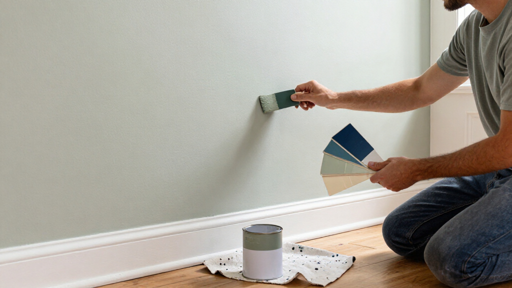
Homeowners considering one of the colors can compare physical samples in the rooms where they plan to use them, checking how they look at different times of day and beside floors, counters and furnishings. They can also review the paint maker’s current product details and finish options; the source does not establish that every named product or formulation is unchanged or available everywhere.
No follow-up study, sales analysis or additional reporting is identified in the supplied material. For now, the roundup remains a collection of designers’ stated favorites and project choices, rather than a measured guide to increasing property value.
Key Questions
Which colors does the roundup highlight?
It includes Behr Mocha Ice and Dragonfly, Sherwin-Williams Tricorn Black and Black Fox, Benjamin Moore Revere Pewter and Misty Air, Farrow & Ball Studio Green and Drop Cloth, and other named shades. The provided source excerpt does not contain the complete entry text for all 15 selections.
Does using one of these colors make a home more valuable?
The source does not provide evidence that any of the colors increases resale value. “Looks expensive” is the roundup’s aesthetic framing, while the designers’ comments are personal opinions and recommendations.
Are the recommendations for neutral colors only?
No. The list includes soft whites and greige as well as dark greens, blue and black. Designers describe using some deeper colors on full rooms or selected features such as cabinets, trim and doors.
How should a homeowner choose among the shades?
Use the recommendations as a shortlist, then test samples in the room and alongside its existing finishes. The roundup does not report controlled comparisons, so the designers’ descriptions cannot predict exactly how a shade will look in every home.
Source: housebeautiful.com