
TL;DR

Get business pricing on tools and workshop supplies
- Business-only prices and quantity discounts
- Tax-exempt purchasing
- Multiple users, one account, clear invoices
A Livingetc report asks interior designers whether butter yellow will last beyond its recent popularity as homes move away from stark whites and cool grays. Designers disagree on whether the shade is timeless, but several say its warmth and versatility can endure while its use evolves toward deeper, earthier colors.
Interior designers interviewed by Livingetc disagree on whether butter yellow is a lasting choice for homes or a shade riding a trend cycle, but several say its warmth and flexibility may outlast its current popularity. Their forecast points toward deeper, earthier colors as possible successors, rather than a single replacement hue.
The report frames butter yellow as a middle ground between neutral and more assertive color. Designers say it can soften rooms dominated by bright white and cool gray while working with materials such as warm timber, natural stone, aged brass and patterned fabrics. Laura Stephens describes it as having the softness of cream with more color and personality, making it suitable as a backdrop rather than necessarily the room’s focal point.
Designers differ on whether that usefulness makes the specific shade timeless. Ailsa MacConnell of Edinburgh-based Studio Mac says butter yellow has been around for years and does not appear to her to be a fleeting trend. She attributes its staying power to its softness and ability to sit alongside many other tones.
Stephens draws a distinction between the color itself and its current level of exposure. She says she would not treat a very specific butter yellow as a timeless neutral in the same way as cream or stone, and warns that a popular color can feel overused if applied everywhere. Her view is that the shade may remain useful even as the way designers use it changes.
A Color Between Neutral and Statement
The debate matters to homeowners weighing whether to use a fashionable color in paint, cabinetry or furnishings. Butter yellow can bring warmth without the intensity of brighter yellow, according to the designers in the report, but its popularity does not guarantee that every application will feel enduring. The practical distinction is between choosing the shade because it suits a home and using it simply because it is currently prominent.
That distinction also affects how much of a room to commit to the color. A restrained use on joinery, cabinets or selected furnishings may be easier to adapt than applying it throughout a space. Designers do not provide a formula for how much is too much; their comments instead emphasize personal preference, surrounding materials and the way the color is deployed.
The predicted move toward more depth and earthiness suggests a change in emphasis, not necessarily a sudden rejection of yellow. Readers should treat that forecast as designers’ interpretation of the trend cycle, rather than a confirmed industry-wide shift or a guarantee that one named shade will replace butter yellow.
Popular right now

Ninja Hot & Iced XL Coffee Maker with Rapid Cold Brew, Black, CM371

Vitamix Propel Series 750 Professional-Grade Blender, 4 Programs, Black

Ninja CREAMi Scoop & Swirl 13-in-1 Ice Cream and Soft Serve Maker, NC701
As an affiliate, we earn on qualifying purchases.
Why Butter Yellow Returned
Butter yellow is not a new color in interiors. Rachel Rector of Florida studio Chinotto House says it has appeared in European and American interiors of the 18th and 19th centuries, as well as in Spanish Mediterranean, Victorian, Colonial Revival and mid-century settings. The current attention is therefore a renewed interest in a historically recurring color, not its first appearance in home design.
Designers interviewed by Livingetc connect the recent revival to a wider preference for softer, warmer rooms after years of stark whites and cool grays. MacConnell says the shade can make interiors feel welcoming without overwhelming them. Emily Reilly of COAL Architecture & Interior Design similarly describes warm buttery yellow walls as more comforting and cheerful than a stark gray or white room.
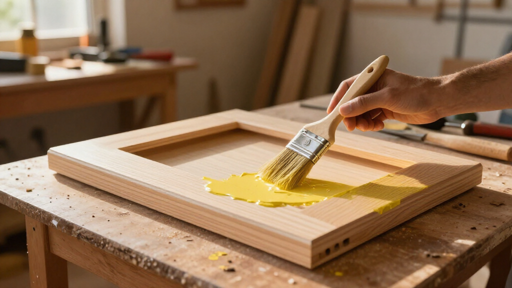
The report includes examples of butter tones used in different ways: Farrow & Ball’s Hay on kitchen cabinets and in bedroom joinery, paired with other colors in the surrounding space. These are design examples, not evidence that a particular paint or application will suit every home.
“Butter yellow has been around for years and will be around for many more to come.”
— Ailsa MacConnell, Studio Mac
No Single Successor Identified
The report does not identify one specific color that will replace butter yellow, nor does it provide sales data, consumer surveys or a measured timeline for the trend’s decline. Its prediction of shades with more depth, warmth and earthiness is a broad design direction, based on the interviewed designers’ views.
It is also unclear how widely those views represent designers or homeowners beyond the people quoted. The source presents differing opinions: some designers see butter yellow as enduring, while others say its exact current form could become overexposed. The extent to which either outcome occurs will depend on how tastes and use of the shade develop.
How Designers May Use It
As the report looks ahead to 2027, the expected development is a change in how designers handle warm yellow tones: the shade may be used more selectively, while colors with greater depth and earthiness gain attention. Livingetc does not give a timetable or name a specific successor, so that direction remains a forecast rather than a settled trend.
For homeowners, the designers’ advice points back to fit and preference rather than a fixed prediction. Butter yellow may make sense where its softness works with the room’s materials and palette; people uncertain about a long-term commitment can limit it to selected surfaces or furnishings. The next test will be whether designers continue to specify it as tastes shift, and whether the warmer, earthier alternatives described in the report become more prominent.
Key Questions
Will butter yellow remain popular in home interiors?
Designers disagree. Ailsa MacConnell believes it will remain relevant, while Laura Stephens says the specific shade may feel overexposed if used too widely. The report does not establish how long its current popularity will last.
What colors could follow butter yellow?
The designers point broadly to shades with more depth, warmth and earthiness. The report does not name one confirmed replacement color.
Why has butter yellow become popular again?
Designers interviewed by Livingetc link its renewed appeal to interest in warmer, softer rooms after a period dominated by stark whites and cool grays. They also say it can add color without feeling as bold as brighter yellows.
How can homeowners use butter yellow without overdoing it?
The designers suggest considering how the shade works with the room and its materials, and using it with restraint rather than applying it everywhere. The report offers examples on cabinets and joinery, but does not prescribe a single approach.
Source: rss