
TL;DR

Get business pricing on tools and workshop supplies
- Business-only prices and quantity discounts
- Tax-exempt purchasing
- Multiple users, one account, clear invoices
Livingetc’s SS27 Style Pulse report describes “discomfort,” or deliberate friction, as an emerging interior design direction for 2027. Designers cited in the report point to acidic color combinations and unexpected forms as ways to challenge a room’s conventions, while stressing that those choices need balance and intention.
Livingetc’s Style Pulse report for spring/summer 2027 identifies “discomfort”—design choices that unsettle expectations without necessarily making a room unpleasant—as an emerging direction in interiors. The report points to acidic color combinations and forms that resist familiar softness, framing them as a departure from the safe, harmonious look associated with the earlier “quiet luxury” moment.
The report’s author uses “discomfort” to describe a brief visual or sensory challenge: a room may feel surprising or slightly jarring at first, rather than simply uncomfortable to occupy. Designer Nicholas Kaiko, founder of Kaiko Design Interiors, suggests “friction” as an alternative term. He says a space can keep evolving through one or two elements that “don’t quite settle,” such as a loud color, an unusual surface or an unexpected piece of furniture.
Kaiko’s qualification is that the friction should be deliberate, not random. The report also quotes designer Sophie Rowell, founder of Côte de Folk, on the role of color. In a bedroom project for a young client, Rowell paired chartreuse with deep purple. She said the combination had visual impact but felt “cocooning rather than chaotic,” attributing that effect to the colors’ depth and richness.
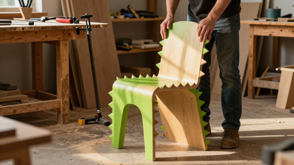
Rowell describes acidic shades such as chartreuse as bringing “freshness and vibrancy” and a tension that conventional colors may not offer. She also cautions that an assertive palette requires attention to balance, proportions and atmosphere. The report extends its argument beyond color to furniture and architectural forms, contrasting a long-running preference for curves and rounded edges with renewed interest in sharper, jagged or pointed shapes.
Why Designers Are Testing Comfort
The trend matters because it points to a change in how some designers talk about a successful home: not every surface or color has to be universally agreeable. The report presents individual expression and selective contrast as alternatives to interiors designed chiefly to look harmonious and safe. That could give clients and designers more room to use personal preferences rather than follow a single standard of conventional taste.
It is not a claim that homes should be unpleasant or that discomfort is a proven, widespread consumer preference. Rather, the examples suggest that a carefully chosen point of tension can make a room feel more distinctive while the rest of its design provides balance. The practical distinction is consequential: visual challenge is not the same as poor usability. A striking palette or angular object can be a stylistic choice, but the report does not establish that every such design works for every occupant or setting.
Popular right now

Bose QuietComfort Wireless Bluetooth Headphones with Active Noise Cancellation, Mic, USB‑C Charging, Deep Bass, 24‑Hour Battery – White Smok

De'Longhi 15-Bar Pump Espresso Machine with Milk Frother & Temperature Control

Sony BRAVIA 5 85-Inch Mini LED 4K HDR Smart TV (K-85XR50)
As an affiliate, we earn on qualifying purchases.
From Quiet Luxury to Friction
The article is one entry in Livingetc’s biannual Style Pulse, a forecast of interior trends for the upcoming season. Its account contrasts the new direction with “quiet luxury,” described as an approach in which elegance is understated and interiors tend toward soft, neutral, inoffensive choices. The report’s author interprets the move toward friction as a reaction to that earlier preference, rather than presenting evidence of a measured market-wide shift.
The examples focus on color and form. Rowell’s chartreuse-and-purple bedroom illustrates how a palette that might seem jarring in isolation can be used to create a contained, enveloping effect. On form, the report sets the popularity of curved furniture and rounded edges against emerging interest in linear, pointed and jagged details. Designer Leah Ring of ANOTHER HUMAN is quoted saying, “An interior that has no tension isn’t that interesting to me.” These are designers’ perspectives and project examples, not sales data or a survey of homeowners.
““What keeps a space evolving is one or two elements that don’t quite settle.””
— Nicholas Kaiko, founder of Kaiko Design Interiors
How Broad Is the Shift?
The report does not quantify how many designers, homeowners or projects are adopting this approach, and it provides no sales figures or survey results establishing its prevalence. “One of 2027’s biggest design trends” is the framing of the trend report, not a measured ranking explained in the material provided. It is also unclear how widely the term “discomfort” will be used: Kaiko prefers “friction,” and the article acknowledges that some designers may not be comfortable with the former label.
The supplied report excerpt ends while introducing pointed and spiked forms, so it does not provide the full discussion or additional examples of that part of the trend. The available material also does not establish whether the style will persist beyond the forecast season or how occupants respond to it over time.
What the SS27 Report Covers
Livingetc presents the article as part of its SS27 Style Pulse, a biannual forecast for the spring/summer 2027 season. Readers can look to the wider report for its other trend entries and further examples. For now, the evidence in this account is a set of designer comments and project descriptions; whether deliberate friction becomes a broad interior preference remains to be seen.
Key Questions
What does “discomfort” mean in this design report?
It describes a brief challenge to expectations, such as a loud color or unusual form, rather than a claim that a room should be physically unpleasant. Designer Nicholas Kaiko calls the idea “friction.”
Which colors does the report use as an example?
Designer Sophie Rowell cites a bedroom pairing of chartreuse and deep purple. She says the combination has visual impact but can feel enveloping when its colors have depth and are balanced.
Does the report say these designs are becoming widespread?
No adoption figures or consumer survey results are provided. The article identifies the approach as a trend in Livingetc’s SS27 forecast, supported by designer views and project examples.
What design elements are associated with the trend?
The report discusses acidic colors, unexpected combinations and forms that challenge familiar softness, including sharper or jagged details. It says successful contrast depends on context and intention.
Source: livingetc.com